Nissan's Logo History: What To Know About Its Timeline
Source: Pixabay
Designing a brand’s logo is more than just creating a visually appealing image. Each car brand’s logo has its unique history and significance. With that said, one of the most recognizable car brand logos in the market is that of Nissan Motor Corporation. You don’t have to be a specialist in Japanese brands to identify the Nissan logo easily.
Regarding car brand logos, Nissan’s is one of the simpler ones out there. It’s mostly just text without any fancy symbols or images. But even so, the Nissan logo is super easy to recognize, and people immediately know what brand it represents when they see it on a car. The logo does a great job of facilitating brand awareness.
However, even in its simplicity, the Nissan logo tells a fascinating story. So today, we walk down memory lane and through the Nissan logo history and how it evolved over the years. Let’s get to it.
Nissan Logo History: The Evolution of an Iconic Japanese Brand
Here is a timeline showing how the iconic Nissan logo has evolved over the years:
1933: The Original Logo
Source: Wikimedia Commons
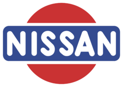
In 1933, Nissan unveiled its inaugural logo, boasting a contemporary and stylish design in a red, white, and blue color scheme. The red circle, a common motif in Japanese logos, represented the sun, while the blue rectangle symbolized the brand’s dependability. The name “Nissan” was prominently displayed in bold, uppercase letters with a clean, sans-serif font, laying the foundation for what would become a legendary brand identity.
NOT JUST FOR CAR SHOPPING
The CoPilot app isn’t just for buying a car - our new CoPilot for Owning tool will help you keep track of recalls and gives you advice on which scheduled maintenance tasks are most important.
Source: Wikimedia Commons
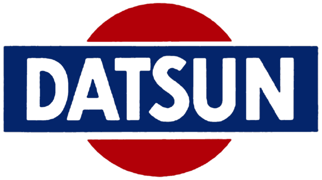
Fun fact: What most people don’t realize is that the original Nissan Logo was inherited from Datsun (as shown above). Datsun first started producing vehicles in 1931. Between 1958 and 1986, Nissan used the Datsun name exclusively for exported cars. In March 1986, Nissan decided to retire the Datsun brand. However, in June 2013, Nissan brought back the Datsun name for a line of budget-friendly vehicles designed specifically for emerging markets.
1940: A Splash of Creativity and Experimentation

Source: Wikimedia Commons
By 1940, Nissan’s logo had transformed significantly. The blue rectangle was replaced with an interesting geometric shape that looked like the front of a car. The font also changed to a friendly, hand-drawn style, with the letter “A” standing out from the rest. Plus, the “rising sun” emblem, a beloved symbol from Nissan’s history, was added above the wordmark, giving it a nostalgic feel.
1950s: Simplicity is Key

Source: Wikimedia Commons
In the 1950s, Nissan decided to go for a more straightforward look with its logo. They chose a design with the brand’s name on a red rectangle with rounded corners and a thick white border. The red of the rectangle matched the color of the brand name. The font they used was bold and angular, with the two “S” letters standing out. This time, all the letters in the name were the same size, a departure from the previous logo.

Source: Wikimedia Commons
In 1959, Nissan tried a modified version of the logo shown above, where the letters of “Nissan” were enlarged and hung over the rectangular background. However, this design lasted only a short time. This look appeared unpolished and unprofessional, and it was a good thing that Nissan abandoned it quickly.
1960s: Cursive Elegance

Source: Wikimedia Commons
In the 1960s, Nissan switched up its logo’s font style once again. This time, they went with a sentence-case italic cursive that gave the logo a more refined and elegant look. The red “Nissan” wordmark was set against a clean white background, creating a simple yet elegant design. When this logo was added to cars, the wordmark was changed to silver, adding a touch of sophistication and luxury.
AI-ASSISTED CAR SHOPPING
Never miss out on the best car, never overpay, and never get taken advantage of. Download the CoPilot app to see the magic of AI-assisted car shopping.
1967: Bold Changes

Source: Wikimedia Commons
During the late 1960s and early 1970s, Nissan played around with many different font styles. The logo ditched the cursive look and went for something wider and bolder, making it easier to read. The bright red color was swapped out for a more muted brown, but that didn’t last long. Soon, the logo featured silver letters against a black background, all surrounded by a sleek silver border. The font got a makeover, too, with all the letters now in uppercase and a classic serif finish.
Perhaps this is one of the most noteworthy departures for the Nissan logo. You probably can’t blame us if we think this logo better suits a chocolate bar than a vehicle. The switch-up to a brown color palette certainly didn’t help.
1983: Back to the Roots
![]()
In 1983, after the decades-long episode of identity crisis, Nissan went back to its roots by bringing back the “rising sun” logo and pairing it with a bold, all-capital letter wordmark in a sans-serif font. At this point in the Nissan logo history, the strong lettering signals the company’s confidence in its brand identity.
2001: Modernity Arrives
Source: Wikimedia Commons
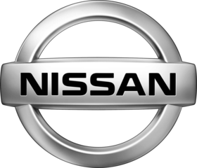
As we stepped into the new millennium, Nissan gave its logo a modern twist to appeal to the tastes of today’s audience. The design was simplified, introducing a sleek silver version that you can still see on some Nissan cars today (this logo was used for nearly two decades). The word “Nissan” was beautifully placed on a silver banner, all wrapped up inside a matching silver circle.
GET A CURATED LIST OF THE BEST NISSAN LISTINGS
The CoPilot app is the smartest way to buy a Nissan. Tell us what you’re looking for and we’ll send you a curated list of the best used Nissan listings in your area - no more scrolling through hundreds of listings looking for hidden gems.
2020: A Minimalist Masterpiece

Source: Wikimedia Commons
In 2020, Nissan unveiled a new, minimalist version of its logo. The designers slimmed down the font and sharpened the circular border around the wordmark. The word “Nissan” cleverly divides the circle into two parts, acting like a banner across the middle.
Since its introduction, the logo has appeared in numerous marketing campaigns, some of which have added 3D effects for added depth and shadows. The logo has also appeared in various colors, including the classic red that has long been associated with the brand.
Nissan Logo History: Evolution of a Brand
And there you have it, the extensive history of Nissan’s logo. The vibrant past and the evolution of its emblem over the years highlight Nissan’s reputation for reliability, all rooted in its rich heritage and tradition.
Get a Curated List of the Best Used Cars Near You
The CoPilot car shopping app is the easiest way to buy a car. Tell us what you’re looking for and we’ll search the inventories of every dealership in your area to make you a personalized list of the best car listings in your area.
Only looking for newer models? CoPilot Compare is the search engine for nearly-new cars. Only see cars five years or newer with low mileage — CoPilot Compare is the best way to find off-lease, early trade-in, and CPO cars.
The best part? CoPilot is built using the same technology that dealerships use to buy and sell their inventories, so we have more info on each vehicle than competitors. CoPilot doesn’t work with dealerships, so there are no sponsored posts or other shady practices — just the most info on the best cars. Check out our About Us page to see how CoPilot works.


