Kia's Logo History: What To Know About Its Timeline
Source: Pixabay
Kia is one of the top car manufacturers on the market, offering a logo that’s simple to recognize from a mile away. However, not everyone is aware that the simple image has undergone many changes over the years. If you’re interested in the Kia logo history, what should you know about the timeline that brought it to where it is today?
If you’re interested in learning more about the history of the Kia logo, you’re in the right place. The more you know, the better you can understand the hard work that went into creating such a significant image. Read on to learn more about the Kia logo through the years and what the image means for the company in its most recent iteration and beyond.
The Kia Logo Through the Years
Among the available car logos on the market, Kia has pushed itself forward to become one of the most recognizable selections on the market. However, it didn’t get that way overnight. It’s taken decades of development to bring the Kia to its current, effective status.
Let’s dive into the Kia logo history, focusing on a few prominent years to clarify major shifts that occurred within the company regarding shifting the logo’s appearance. You might be surprised to consider how it started and where it is now.
FEEL SECURE IN THE CAR YOU CHOOSE
You don’t want to buy a car - you want to get the best deal on the car you’re looking for. The CoPilot app will notify you if there’s a similar vehicle in your area at a better price, so you’re always certain you got the best deal available.
1944
The first year for the Kia logo was 1944, offering a much more intricate design than the one we know today. Instead of simple letters, it was shaped like three diamonds and gears surrounding the Kia name. It matched the company’s goal at the time, which was to sell bicycle components.
It might be too much of a logo for today, but back in 1944, it was a revolutionary design for the company. Monochrome colors conveyed professionalism and established Kia as a company with high authority, even in the beginning stages of its endeavors in the machine-building market.
1964
In 1964, Kia decided to change the game dramatically with a “Q” logo in bold green. This design emerged right as Kia began making its way into the car manufacturing business, so it makes sense that their logo would serve to reflect them in a time of uncertainty and excitement. It was certainly a standout in a different way than their original.
Although it might seem like a shock, this letter was the logo for Kia for a long time. In fact, it would be more than two decades before Kia decided to try anything else for their logo. Those growing up in this time knew the green Q to be Kia.
1986
In 1986, Kia made another change to their logo. They moved away from the green Q and decided a watermark would be a better choice to display their brand to the world. It took the name Kia and added some critical stylized details to it, making it more memorable than the three letters would be without some design changes and shifts.
Instead of a thinner lettering, Kia decided to go with a chunky, bold typeface. They added a line to the top of the K, making it look like it had a flag proclaiming itself to the world. It was wavy and blue with the intent to make more of a statement to the world instead of something so simple.
ARE KIAS RELIABLE?
If you want to know if Kias are reliable, you’ve come to the right place. CoPilot is here to walk you through Kia’s past and current reputation, some models to look out for, and anything else you need to know.
1994
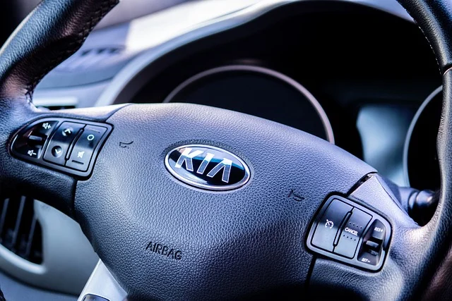
The next change came nearly a decade later in 1994. This change was one of the most significant the car’s logo would ever undergo, pushing it much closer to the modern design. This style would remain this way for nearly three decades, showing it was an effective choice for the brand.
Kia decided to write out their entire name again but placed it in bold red lettering inside a circle. It was meant to be as clear and straightforward as possible, speaking right to the customer instead of offering confusing imagery.
This version of the logo was meant to use red as the core to show the passion and excitement of the brand. By placing the red logo against a white background, Kia meant to show loyalty to their customers.
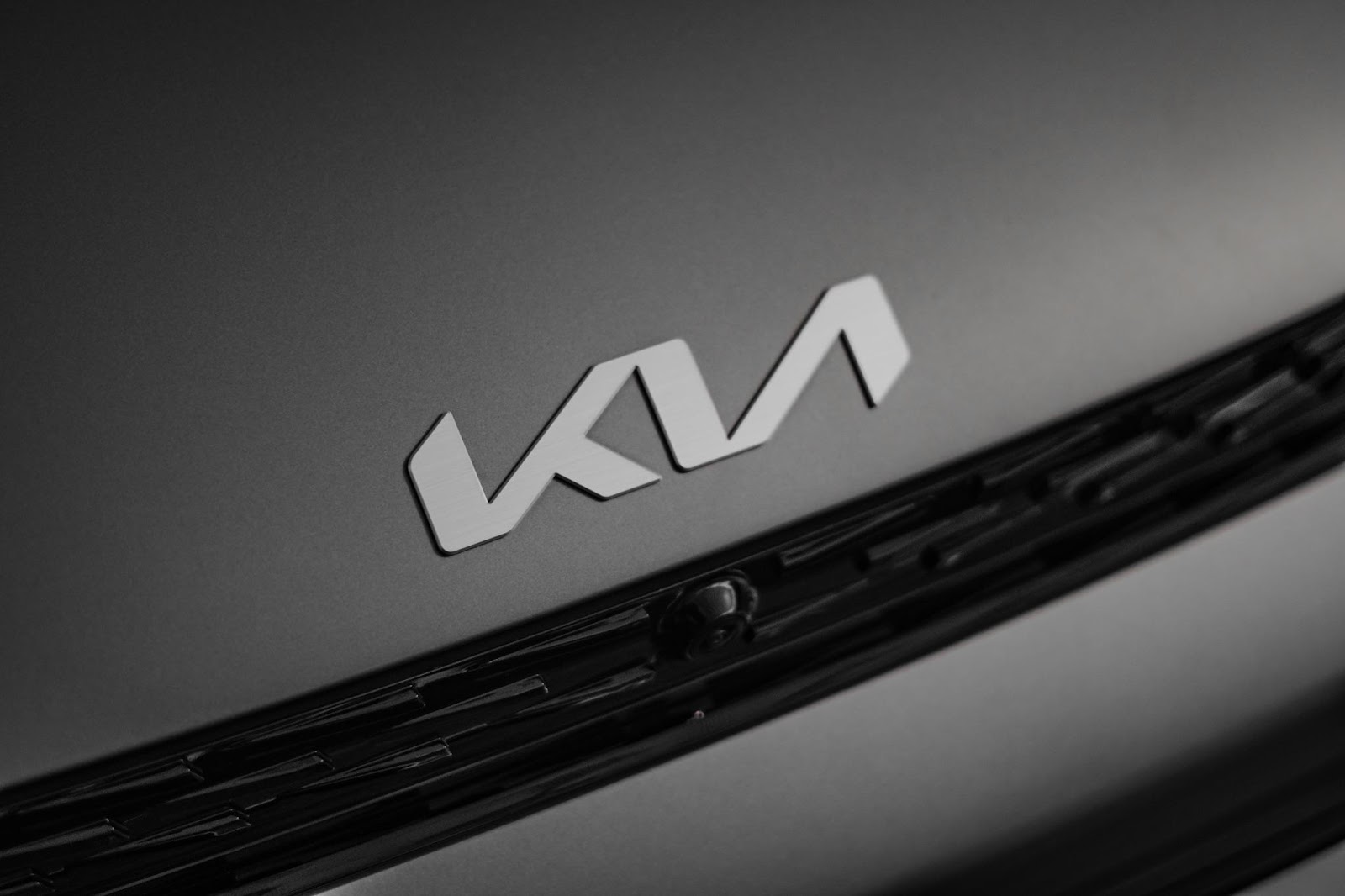
2021
Source: Unsplash
The most recent change occurred in 2021. It’s a very modern and updated design, sometimes arriving in red and at other times appearing in black. Kia decided to remove the circle entirely, simplifying the design and pushing the letters together to make it seem like they were one cursive-type word. It’s very modern and up to date.
This version of the design is much more appealing to a car and helps it stand out against competitors. We’ll likely see it continue to develop in the years to come.
AI-ASSISTED CAR SHOPPING
Never miss out on the best car, never overpay, and never get taken advantage of. Download the CoPilot app to see the magic of AI-assisted car shopping.
What Does the Kia Logo Mean?
We’ve gone over the Kia logo history but haven’t talked too much about what the Kia logo means. Is there a meaning behind the design, or did the brand just create it to look cool?
We mentioned one of the main concepts of the logo with the red to demonstrate passion and the white background to prove the loyalty of the brand to their customers. However, there are other possible explanations for the design.
Others state that the Kia logo is meant to represent an attempt to streamline systems and reveal the act of working together. It shows the success of working together and the advancement of technologies, movement, and other valuable items in the manufacturing world.
Final Thoughts
From the 40s all day to today, the Kia company is working to dive into the future. Nowhere is that clearer than how much their logo has changed shape over the years. Today, it’s nowhere near the original image that made it what it is.
We hope this dive into the Kia logo history was helpful! Although it might not seem like a big deal to some, understanding where the logo came from and why it is the way it is today can actually provide a new appreciation for something as subtle as a small metal plate on a car.
Get a Curated List of the Best Used Cars Near You
The CoPilot car shopping app is the easiest way to buy a car. Tell us what you’re looking for and we’ll search the inventories of every dealership in your area to make you a personalized list of the best car listings in your area.
Only looking for newer models? CoPilot Compare is the search engine for nearly-new cars. Only see cars five years or newer with low mileage — CoPilot Compare is the best way to find off-lease, early trade-in, and CPO cars.
The best part? CoPilot is built using the same technology that dealerships use to buy and sell their inventories, so we have more info on each vehicle than competitors. CoPilot doesn’t work with dealerships, so there are no sponsored posts or other shady practices — just the most info on the best cars. Check out our About Us page to see how CoPilot works.