Hyundai's Logo History: What To Know About Its Timeline

Source: Pixabay
Although Hyundai is one of the top competitors in the car world, its logo isn’t always the most recognizable. Sometimes it’s mistaken with Honda, while others don’t know the company. Still, there is an intricate Hyundai Logo history, all made to mark Hyundai as a brand of innovation and practicality among competitors.
If you’re interested in learning more about the history of the Hyundai logo, you’re in the right place. The more you know about this mark, the easier it will be to appreciate where the Hyundai logo came from and the place it’s in today. Read on to learn more about the logo through the years and what it means for the company.
The Hyundai Logo Through the Years
Although it’s still not the most recognizable selection, the Hyundai logo has pushed itself forward to become a top contender on the market. However, it didn’t get to where it is now with a single logo shift - it’s been years of change.
Let’s discuss the Hyundai Logo history, talking specifically about the years when the logo underwent serious change. It might be a shock to see where the image came from and how it got to where it is today according to fabrikbrands.com.
1969
The logo for Hyundai came to life for the first time in 1969, starting in an unrecognizable place from where it is today. The original Hyundai logo looked like a car window on top of a large circle. The letters HD were added to the core of the window, making it look more like a strange stamp than a car logo.
The appearance of the Hyundai logo in 1969 was drastically different from other selections on the market. It was very minimalist, with black and white and geometric designs.
By the time 1970 hit, there was a slight update. Hyundai stretched everything out into an oval shape and made the window more central to the design. It was starting to come to life, but still far from where it would be several decades into the future.
NOT JUST FOR CAR SHOPPING
The CoPilot app isn’t just for buying a car - our new CoPilot for Owning tool will help you keep track of recalls and gives you advice on which scheduled maintenance tasks are most important.
1978
Rather than making a slight shift, Hyundai decided to completely alter the logo in 1978. They used a watermark style instead, writing out the capital HD and surrounding it in a square, then writing Hyundai in Korean next to this basic geometric format as that’s where the company was.
This shape was very simple yet seemed to represent elegance and class. It appeared in a deep blue color, backed by white with the seeming intent to convey class and trustworthiness. The sleek shapes were very professional and determined the dependability of the brand at the time.
1990
In 1990, another large shift happened to the Hyundai logo. It was the very first time the logo represented something closer to the modern symbol as we know it now, removing the combination of the letters “HD” and simplifying it to focus on the first letter - the “H”. It was an excellent choice for the car business.
The new logo turned into a slightly slanted “H” surrounded by a slanted oval. It remained dark blue and white, like the previous design.
The “H” stands for the first letter of the company. However, it was also supposed to look like two people shaking hands to reveal the general sentiment of the Hyundai manufacturer.
The image was updated again in 2003, offering a slight shift to the 1990 upgrade. It added the Hyundai name in English, revolutionizing the brand’s image yet again. The company used sans-serif font to add a modern flare to make the design better fit the modern times.
ARE HYUNDAIS RELIABLE?
Are Hyundais reliable? Past Hyundai models have questionable quality and reliability, but these days, they’re some of the most reliable vehicles available.
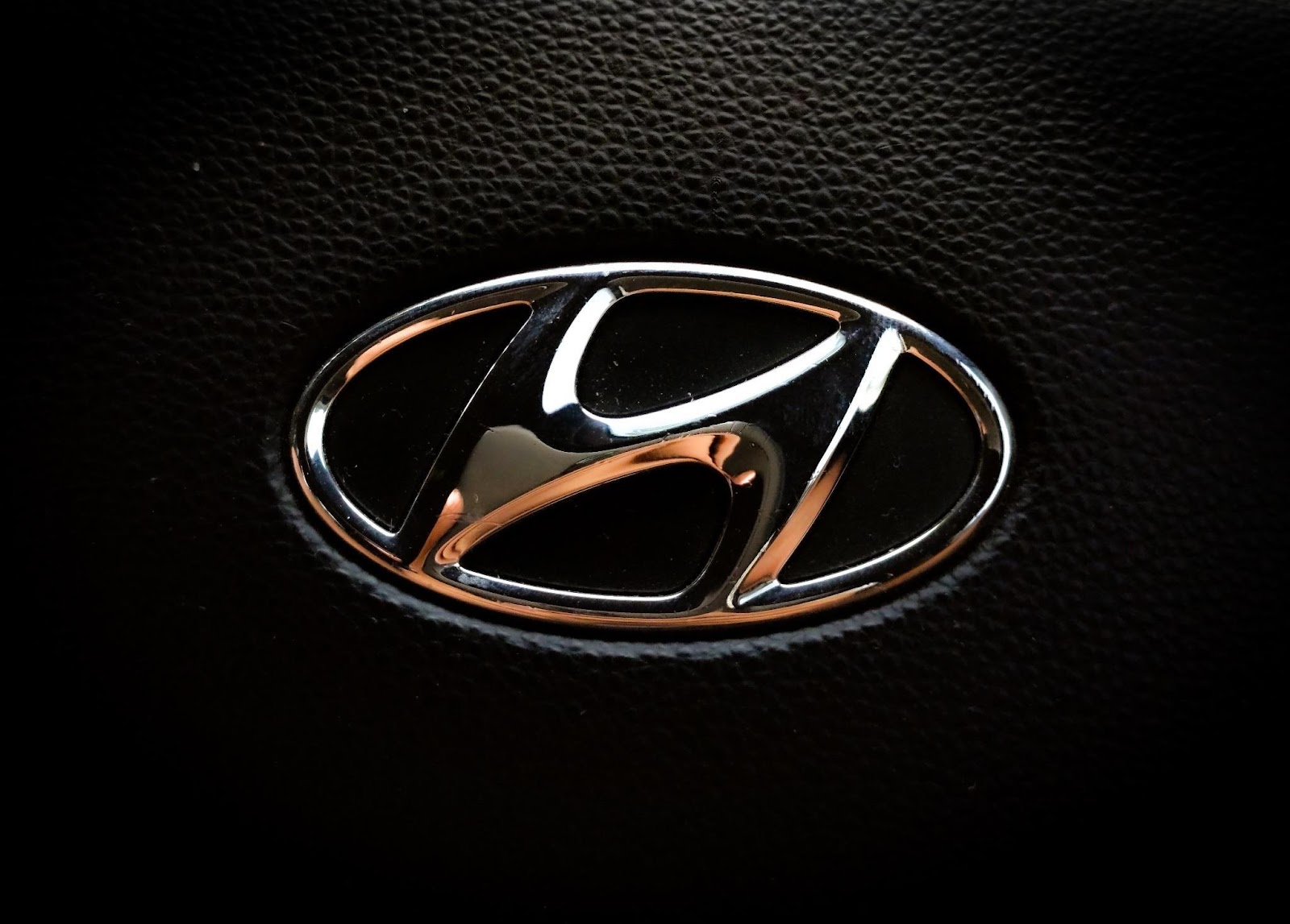
2017
Source: Unsplash
The final change in the Hyundai logo occurred today and is the symbol we know and love on their cars. There weren’t many significant shifts here. The company decided to stick with the blue for the Hyundai section and shifted the symbol to silver instead of the iconic blue.
The Hyundai logo today ensures it uses the design from the past, but adds clear line distinctions, edges curves, and a sharper color to help it stand out on a car, on paper, in an advertisement, and beyond. The silver helps make it look much more sophisticated and helps it pop off the page like it’s come to life.
The angular change was only slight but made a large difference in the general sentiment given by examining the logo. It’s a testament to what careful design and attention to detail can do for any company’s appearance on the market, car market, and beyond.
AI-ASSISTED CAR SHOPPING
Never miss out on the best car, never overpay, and never get taken advantage of. Download the CoPilot app to see the magic of AI-assisted car shopping.
What is the Meaning of the Hyundai Symbol?
We’ve talked about the Hyundai Logo history, but what exactly is the meaning of the Hyundai symbol? We touched on it briefly, but let’s discuss it a little more.
The goal of the modern Hyundai symbol is to appear like two people shaking hands. This symbol reveals the team’s commitment to customer service and working well within their team, creating the ultimate experience for everyone involved in the iconic manufacturer.
Another possible representation of the Hyundai symbol is a customer shaking hands with a sales representative at a manufacturing location. It depicts a successful sale and a history of satisfaction within their business model.
Also, the slight slant in the Hyundai logo design might demonstrate their goal to expand worldwide, making a global impact on the market. It might seem like a simple letter, but there is so much more to Hyundai’s logo than what first meets the eye.
Final Thoughts
From the 60s until today, Hyundai has undergone change. Nowhere is that more apparent than in the many forms of the logo, emerging into the shape it is today. It will likely continue to shift as time goes on.
The Hyundai Logo history is an impressive feat and something most people forget about. With an understanding of the work over the years, it will become much easier to appreciate the brand and all the work that goes into design.
Get a Curated List of the Best Used Cars Near You
The CoPilot car shopping app is the easiest way to buy a car. Tell us what you’re looking for and we’ll search the inventories of every dealership in your area to make you a personalized list of the best car listings in your area.
Only looking for newer models? CoPilot Compare is the search engine for nearly-new cars. Only see cars five years or newer with low mileage — CoPilot Compare is the best way to find off-lease, early trade-in, and CPO cars.
The best part? CoPilot is built using the same technology that dealerships use to buy and sell their inventories, so we have more info on each vehicle than competitors. CoPilot doesn’t work with dealerships, so there are no sponsored posts or other shady practices — just the most info on the best cars. Check out our About Us page to see how CoPilot works.