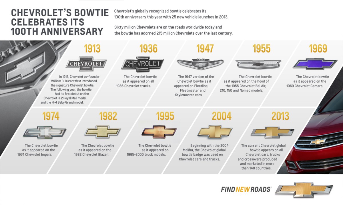
Chevrolet's Logo History: What To Know About Its Timeline

Source: Pixabay
Founded in 1911 by Louis Chevrolet and William C. Durant, Chevrolet has become one of the world’s most iconic automotive brands. With a rich history spanning over a century, Chevrolet has consistently been at the forefront of automotive innovation and design.
Its lineup has included iconic vehicles like the Suburban, Corvette, and Camaro – all symbols of American muscle and performance. In 1955, Chevrolet introduced the small-block V8 engine, which remained in production for over 50 years.
The Chevrolet logo, commonly referred to as the “Chevy bowtie,” is a symbol that has been associated with the brand for over a century. Today, let’s travel back in time to talk about the Chevrolet logo history.
Chevy Logo History: Origins and Speculations
The Chevy logo, characterized by its cross or bowtie shape, was first introduced in 1913 by Chevrolet co-founder William C. Durant. While the exact origin remains a mystery, several theories have emerged.
- According to the The Chevrolet Story of 1961, the design was a product of Durant’s creative mind. In 1908, during his travels around the world, he came across a captivating pattern on the wallpaper of a French hotel, which seemed to extend infinitely. Intrigued, he ripped off a piece of the wallpaper and held onto it, thinking it would serve as an excellent emblem for a car’s nameplate to show to his friends.
- Another theory, supported by Durant’s daughter Margery, claims that the design was entirely original, stemming from Durant’s habit of sketching nameplate designs.
- A third theory, backed by Durant’s wife Catherine, posits that the logo was inspired by a newspaper advertisement Durant saw in Virginia. This theory gained traction when a similar logo was found in a 2011 newspaper advertisement.
Regardless of its true beginnings, the Chevy Bowtie has cemented itself as a hallmark of the Chevrolet brand.
DOWNLOAD THE FREE APP
The CoPilot car shopping app is the smartest way to buy a car. Get a curated list of the best cars for sale in your area, as well as notifications if a similar vehicle is listed nearby at a lower price. CoPilot is the smartest way to shop for used cars.
Evolution of the Chevy Logo
Source: Chevrolet Media Pressroom
The Chevy logo has undergone various transformations over the years, with certain elements remaining consistent:
- 1911: The initial logo was based on the signature of co-founder Louis Chevrolet. This black, bold handwritten design was used from 1911 to 1914.

Source: 1000logos.net
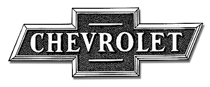
- 1913: The renowned bowtie emblem was introduced, marking the beginning of an iconic branding journey. The logo was white and light blue with a gold outline, and the word “Chevrolet” spanned across it until 1934.
Source: Chevrolet Media Pressroom
- 1934: Chevrolet transitioned from its light-colored palette to a sleek monochrome design, updating the “Chevrolet” text to a more contemporary typeface. The letters were enlarged, lending the emblem a more solemn and significant appearance compared to its predecessor. This design iteration was used until 1940.
- 1940: Chevrolet reintroduced the blue-gold theme, opting for a more modern, flat design. The colors were vibrant and exuded a youthful energy. In this version, the gold outline was thicker and confined to the exterior of the cross. This design remained in use until 1957.
ARE CHEVROLETS RELIABLE?
Finding exactly what you need to know about how reliable Chevrolets are can be tricky, so CoPilot is here to give you all the necessary information on Chevrolet.

Source: GM Newsroom
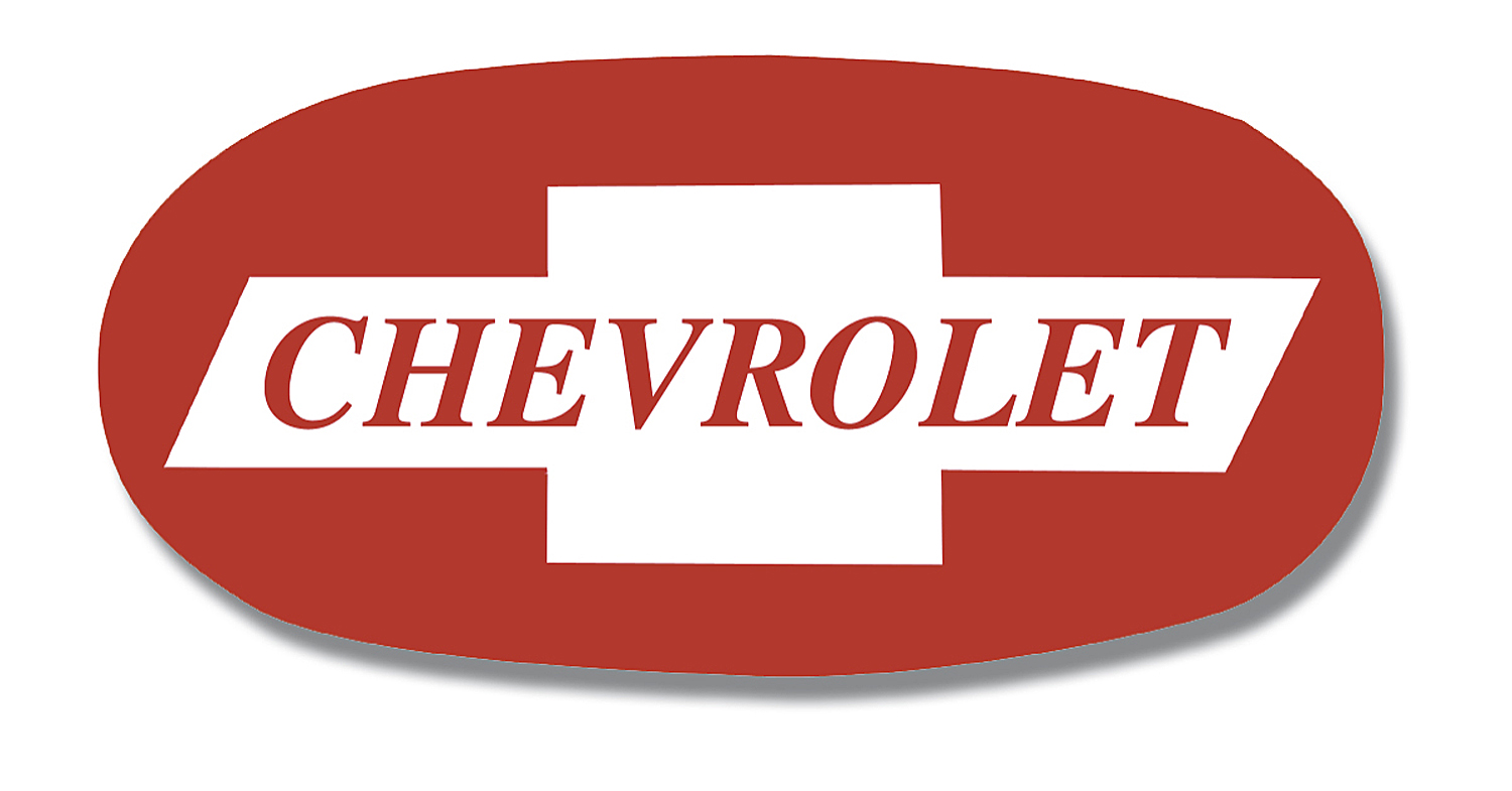
- 1957: The 1957 version of the Chevy bowtie logo was a weird design consisting of a large red oval shape with the bowtie inside, accompanied by red lettering and white highlights. It’s unclear why this change was made, but some suggest it could have been to emphasize Chevrolet’s performance. This design was short-lived and was discarded in 1960.
Source: Chevrolet Media Pressroom
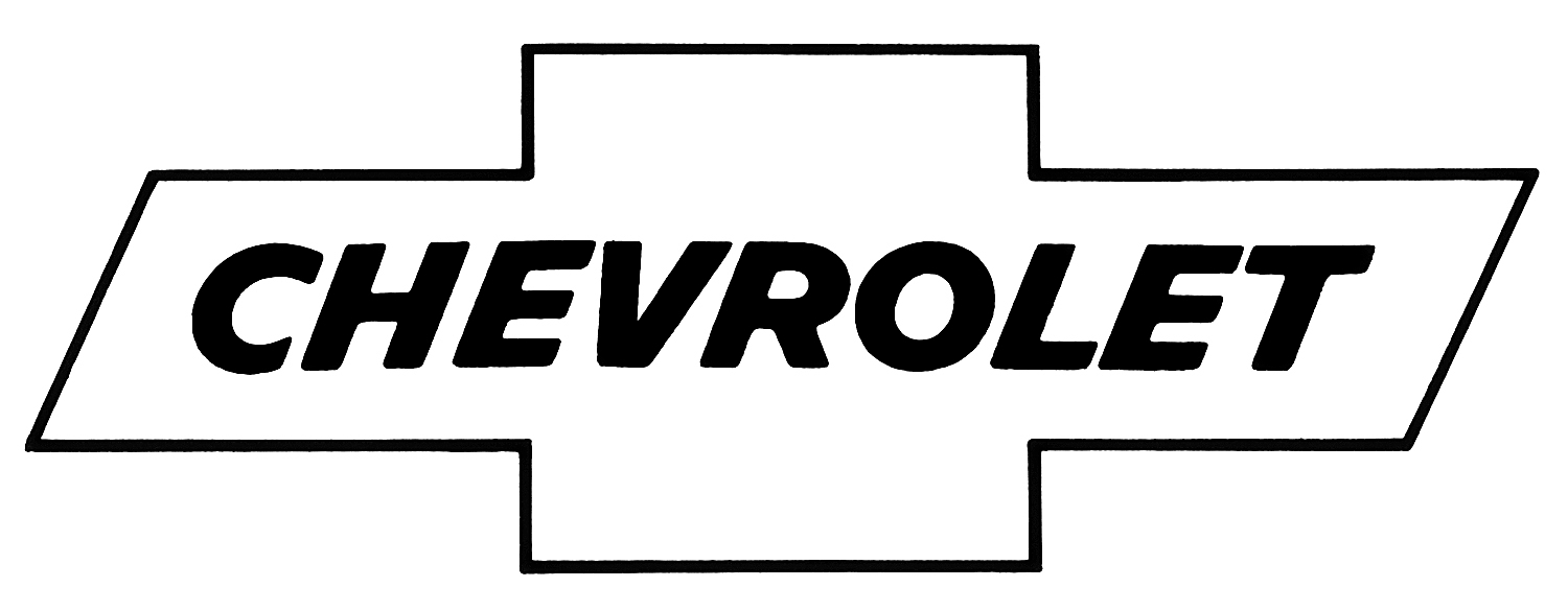
- 1960: Chevrolet chose a monochrome design, creating the most minimalistic bowtie logo to date. A slim black outline formed the symbol, with the wordmark in italicized black font. This version graced Chevrolet vehicles from 1960 to 1977.
Source: Chevrolet Media Pressroom
- 1977: Chevy redesigned their logo, incorporating a blue color and a thin white outline inside the bowtie. The word “Chevrolet” was centered within the emblem.
- 1985: The bowtie logo underwent a significant transformation in 1985, evolving into the familiar variant we recognize today. This dramatic change coincided with the logo’s debut in television advertisements, propelling it to widespread popularity.
- 2000: In 2000, Chevy embraced the color red again, choosing a subtle design centered around the single symbol. The previous flat design evolved into a 3D rendition, finished in a rich reddish hue. This modern minimalist version pays homage to the 1960s monochrome design.

Source: Chevrolet Media Pressroom
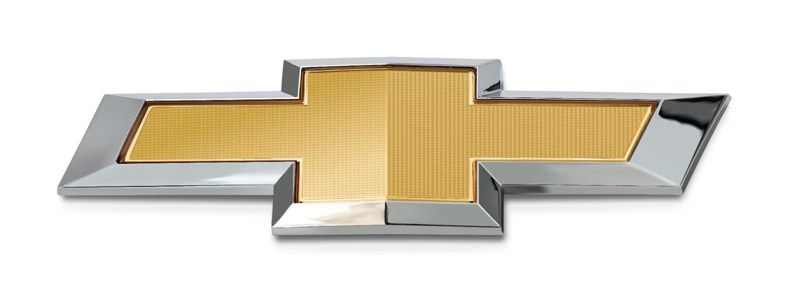
- 2004: Chevy introduced gold to its bowtie symbol, marking a shift from the brand’s previous inclination towards bright and eccentric layers in its emblem. This new aesthetic underscored Chevrolet’s status as one of the world’s most iconic logos. This design remained in use until 2011.
AI-ASSISTED CAR SHOPPING
Never miss out on the best car, never overpay, and never get taken advantage of. Download the CoPilot app to see the magic of AI-assisted car shopping.

Source: Chevrolet Media Pressroom
- 2011: Chevrolet redesigned its logo to celebrate its 100th anniversary. The new logo retained the emblem’s gold color but had a thicker silver frame, giving it a more luxurious look. This latest iteration makes the logo appear more dynamic and robust, reflecting the brand’s rich history and its focus on the future.
Source: Chevrolet Media Pressroom
Subtle Refinements Over Time
As you can see, while the foundational bowtie design has remained unchanged (at least after the original signature design), it has seen subtle modifications in color, dimensions, and form over the decades. These tweaks, coupled with its integration into various marketing initiatives and product series, have fortified its status as one of the most recognizable automotive emblems.
The Bowtie in the Modern Era
That wraps up our roundup of the Chevy Logo history. The Chevy logo is known worldwide in 140 countries and represents excellence, reliability, and innovation. Chevrolet has always maintained these qualities, and the Chevy Bowtie has become an iconic symbol of American car heritage. As Chevy continues to grow and innovate, the Bowtie remains a symbol of the brand’s commitment to quality and innovation.
Get a Curated List of the Best Used Cars Near You
The CoPilot car shopping app is the easiest way to buy a car. Tell us what you’re looking for and we’ll search the inventories of every dealership in your area to make you a personalized list of the best car listings in your area.
Only looking for newer models? CoPilot Compare is the search engine for nearly-new cars. Only see cars five years or newer with low mileage — CoPilot Compare is the best way to find off-lease, early trade-in, and CPO cars.
The best part? CoPilot is built using the same technology that dealerships use to buy and sell their inventories, so we have more info on each vehicle than competitors. CoPilot doesn’t work with dealerships, so there are no sponsored posts or other shady practices — just the most info on the best cars. Check out our About Us page to see how CoPilot works.